
Preloader is something which is added at last to your website after all the works in design is done and dusted. Preloader is not a necessary feature for your website but it is used in most of the websites nowadays or we can say that it’s hard to see any website whiich is not using such preloaders. Preloaders are not worth of much hard work. It is just an animation which appears on the screen when some loading occurs and only last for seconds. So what I would like to share with everyone is a simple method to create a preloader. I will demonstrate each and every step in creating a preloader in this post. I hope you guys like it !.
Let’s get into the action
1. Making the basic HTML website without any preloader
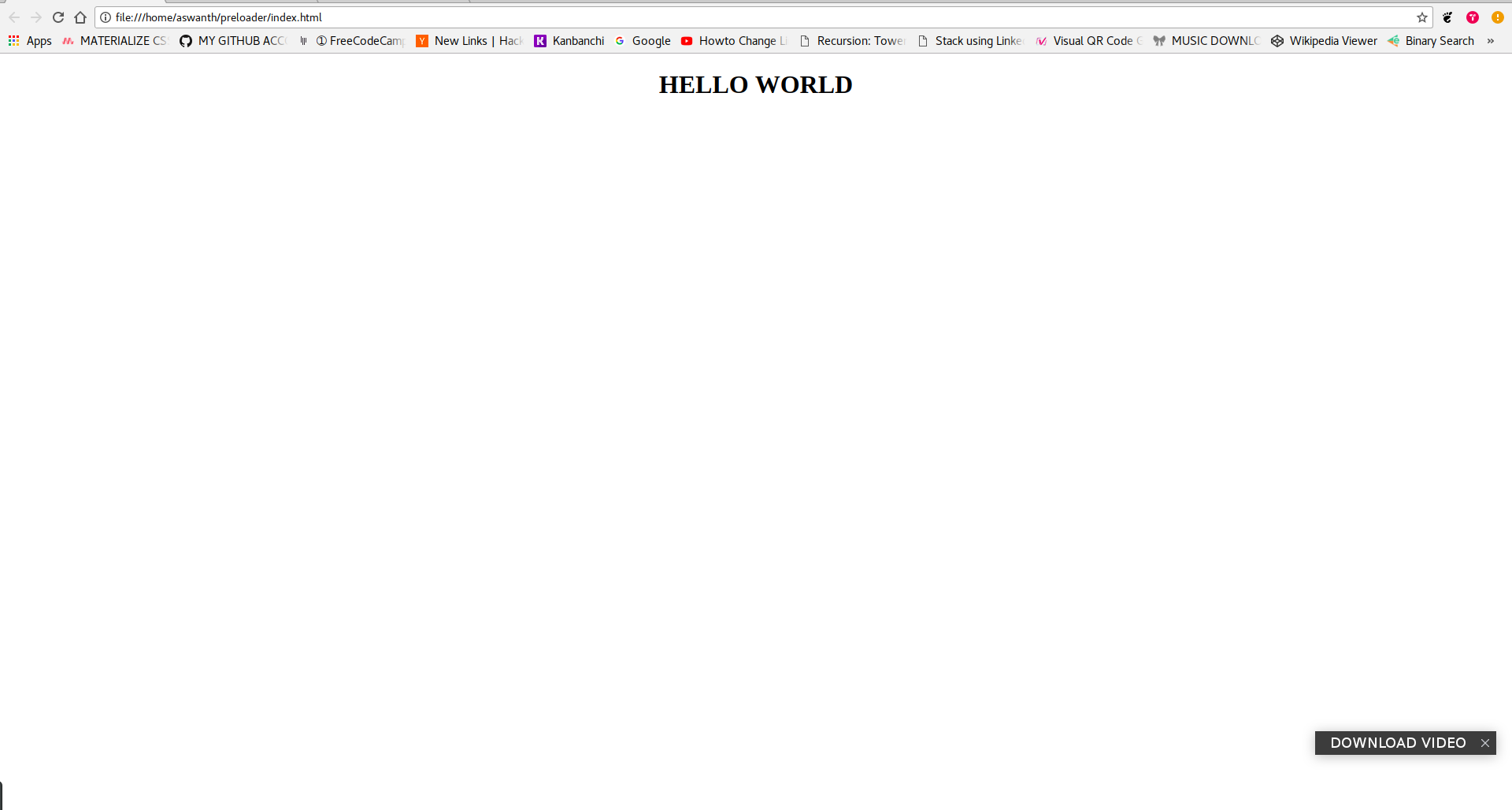
First of all, we need a webpage to which we have to add the preloader to. Since this is a demonstration, We will just create a normal webpage displaying “HELLO WORD”. What we have to take care while writing this part is to ensure that include this “HELLO WORLD” text is enclosed within a DIV tag of any ID. Here, I will use DIV tag of ID = container .
The final code looks like this :
    <!DOCTYPE html>
    <html lang="en">
    <head>
        <meta charset="UTF-8">
        <meta name="viewport" content="width=device-width, initial-scale=1.0">
        <meta http-equiv="X-UA-Compatible" content="ie=edge">
        <title>Preloader tutorial</title>
    </head>
    <body>
        <div id="container">
            <center><h1>HELLO WORLD</h1></center>
        </div>
    </body>
    </html>
Save this code as index.html
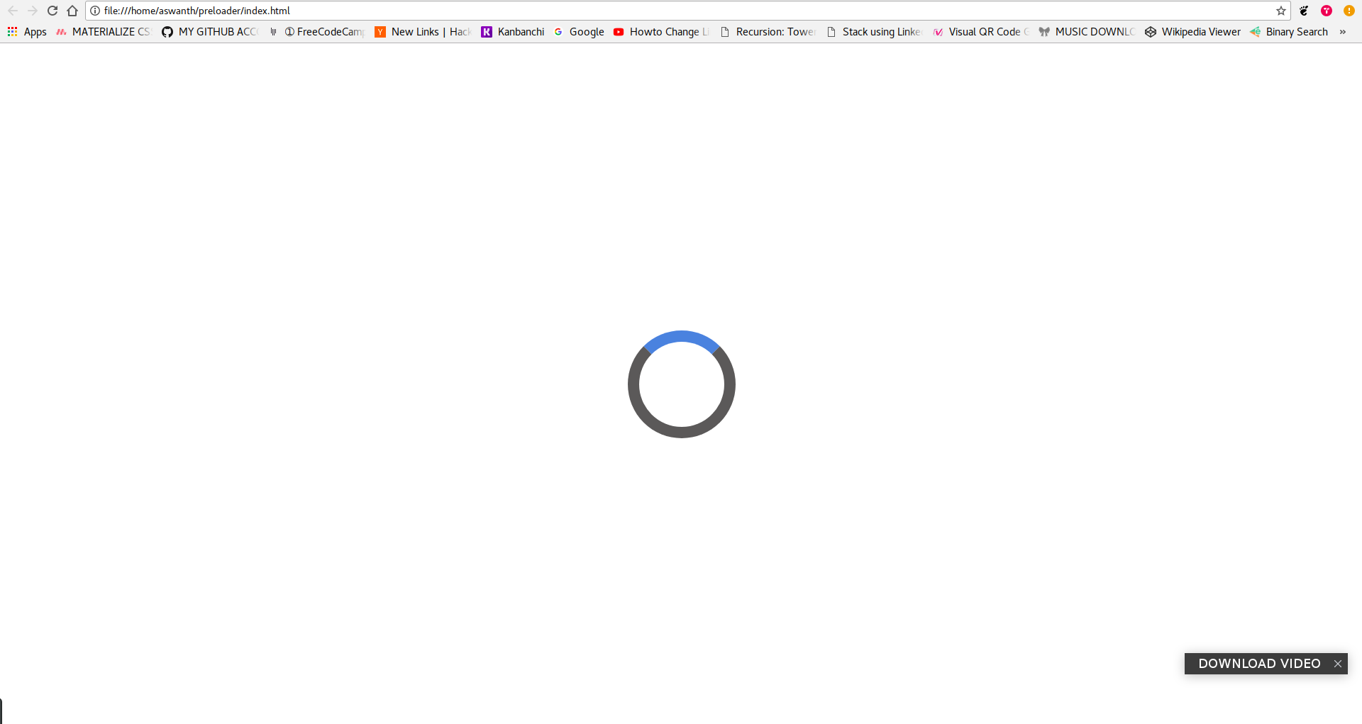
2. Making a simple loader
Now leave the part of creating content in website and let’s focus on creating the loader. You can create simple loader using just CSS and HTML. we just have to place a pair of div tags of ID = loader. Now we will write the css code separately for the loader. The following is a simple CSS code for just the loader without its rotating animation.
#loader {
  position: absolute;
  left: 50%;
  top: 50%; /* centering the loader */
  z-index: 1;  /* To display one layer above  */
  width: 150px;  /* Height and width of the loader container */
  height: 150px;
  margin: -75px 0 0 -75px; /* Fixing te size of loader circle*/
  border: 16px solid #5a5959; /* Border thickness of 16px of solid attribute and of border caller  */
  border-radius: 50%; /* To make it circle */
  border-top: 16px solid #3498db; /* To give color to only the top part of the border */
    }
Place this code between <style> and </style> tags within the heading tag.
Now lets create animation to the loader. Add this code to create animation :
-webkit-animation: spin 2s linear infinite;/* To make the loader spin  */
  animation: spin 2s linear infinite;
The above code should be added within ` #loader { }`
Now add this code to make it spin
@-webkit-keyframes spin {
  0% { -webkit-transform: rotate(0deg); }
  100% { -webkit-transform: rotate(360deg); }
}

@keyframes spin {
  0% { transform: rotate(0deg); }
  100% { transform: rotate(360deg); }
}
Final code looks like this :
    <!DOCTYPE html>
    <html lang="en">
    <head>
        <meta charset="UTF-8">
        <meta name="viewport" content="width=device-width, initial-scale=1.0">
        <meta http-equiv="X-UA-Compatible" content="ie=edge">
        <title>Preloader tutorial</title>
    </head>
    <style>
        #loader {
  position: absolute;
  left: 50%;
  top: 50%; /* centering the loader */
  z-index: 1;  /* To display one layer above  */
  width: 150px;  /* Height and width of the loader container */
  height: 150px;
  margin: -75px 0 0 -75px; /* Fixing te size of loader circle*/
  border: 16px solid #5a5959; /* Border thickness of 16px of solid attribute and of border caller  */
  border-radius: 50%; /* To make it circle */
  border-top: 16px solid #3498db; /* To give color to only the top part of the border */
  -webkit-animation: spin 2s linear infinite;/* To make the loader spin  */
  animation: spin 2s linear infinite;
}
@-webkit-keyframes spin {
  0% { -webkit-transform: rotate(0deg); }
  100% { -webkit-transform: rotate(360deg); }
}

@keyframes spin {
  0% { transform: rotate(0deg); }
  100% { transform: rotate(360deg); }
}

    </style>
    <body>
        <div id="loader"></div>
        <div id="container">
            <center><h1>HELLO WORLD</h1></center>
        </div>
    </body>
    </html>
3. Removing the loader when the content is loaded
This is the last step of creating the preloader .
For this we require the help of Jquery.To use Jquery, you have to insert the following code just after the </body> tag :
<script src="https://code.jquery.com/jquery-2.1.3.min.js"></script>
Then we have to write a jquery script to hide the loader animation when the content loads and then display the content with some fading in and fading out animation. For that we need to first the hide the content by default. And using jquery we will display this content when its loaded completely.Add the following code for that :
#container {
    display : none  /* To hide the content div */
}
Include the above code within the <style> tag .
<script>
$(document).ready(function () { /* When the content is loaded */
    $("#container").fadeIn(2000); /* Display the content */
    $("#loader").fadeOut(); /* Hide the loader */
});
</script>
Insert the above code after this line <script src="https://code.jquery.com/jquery-2.1.3.min.js"></script>
Here the fadeIn() and fadeOut() functions create the fading animations.
Final code looks like this :
    <!DOCTYPE html>
    <html lang="en">
    <head>
        <meta charset="UTF-8">
        <meta name="viewport" content="width=device-width, initial-scale=1.0">
        <meta http-equiv="X-UA-Compatible" content="ie=edge">
        <title>Preloader tutorial</title>
    </head>
    <style>
        #loader {
  position: absolute;
  left: 50%;
  top: 50%; /* centering the loader */
  z-index: 1;  /* To display one layer above  */
  width: 150px;  /* Height and width of the loader container */
  height: 150px;
  margin: -75px 0 0 -75px; /* Fixing te size of loader circle*/
  border: 16px solid #5a5959; /* Border thickness of 16px of solid attribute and of border caller  */
  border-radius: 50%; /* To make it circle */
  border-top: 16px solid #3498db; /* To give color to only the top part of the border */
  -webkit-animation: spin 2s linear infinite;/* To make the loader spin  */
  animation: spin 2s linear infinite;
}
@-webkit-keyframes spin {
  0% { -webkit-transform: rotate(0deg); }
  100% { -webkit-transform: rotate(360deg); }
}

@keyframes spin {
  0% { transform: rotate(0deg); }
  100% { transform: rotate(360deg); }
}
#container {
    display : none  /* To hide the content div */
}
    </style>
    <body>
        <div id="loader"></div>
        <div id="container">
            <center><h1>HELLO WORLD</h1></center>
        </div>
    </body>
    <script src="https://code.jquery.com/jquery-2.1.3.min.js"></script>
    <script>
            $(document).ready(function () { /* When the content is loaded */
                $("#container").fadeIn(2000); /* Display the content */
                $("#loader").fadeOut(); /* Hide the loader */
            });
            </script>
    </html>
Your preloader is ready . Hope you guys got the idea !.